End-to-end Machine Learning project with R (part 1)
In this example, we will go through a machine learning project from beginning to end, from the getting the data, to visualizing features with graphs, from fitting models to tunning parameters to evaluate performance.
This example uses the classic 1990 California Housing dataset and follows the instruction from O'Reily's "Hands-on machine Learning with Scikit-learn and Tensorflow", albeit in R code.
There are several steps that could be involved in a data science/machine learning project. Canonically, there are 5 steps belows:
1. Get the data
2. Explore and visualize data for insights
3. Cleaning data for machine learning algorithms
4. Select and train model
5. Tune the parameters (if possible) for performance-enhancement
If you are working in a professional setting, there could be equally important steps that follow such as:
6. Present your findings and solutions
7. Create, launch and maintain a scalable system
I. Get the Data
In this example, we will be using the 1990 California Housing Prices Dataset from the StatLib repository. This is obviously not the most recent data (guess how much the real estate market have boomed - and busted since then). You can easily find more recent or similary dataset (Boston Housing data being one of the more popular) from online repositories.
For starter, this dataset contains information such as population, median income, median housing price, total rooms for each geographical unit under the US Census Bureau (each unit typically has a population of 600 to 3,000 people).
 link <- "http://www.dcc.fc.up.pt/~ltorgo/Regression/cal_housing.tgz"
 download.file(link, destfile = "./cal_housing.tgz")
 untar("cal_housing.gz")
 cal_housing <- read.csv("~/CaliforniaHousing/cal_housing.data")
Note that in any data project, it's most vital to frame the problem before diving into the datasets. The first question to ask is what exactly the business objective is. For the purpose of this tutorial, let's say our objective is to build a model that predicts the median house price for each geographical units.
II. Explore and visualize data for insights:
At first, we can take a quick look at our dataset. A few handy functions that I found particular usefuls are:
- head()
- dim()
- str()
- summary()
 dim(cal_housing)
 #[1] 20640    10
 summary(cal_housing$total_bedrooms)
 #Min. 1st Qu.  Median    Mean 3rd Qu.    Max.    NA's
 #1.0   296.0   435.0   537.9   647.0  6445.0     207

head(cal_housing)| longitude | latitude | housing_median_age | total_rooms | total_bedrooms |
|---|---|---|---|---|
| -122.23 | 37.88 | 41 | 880 | 129 |
| -122.22 | 37.86 | 21 | 7099 | 1106 |
| -122.24 | 37.85 | 52 | 1467 | 190 |
| -122.25 | 37.85 | 52 | 1274 | 235 |
| population | households | median_income | median_house_value | ocean_proximity |
|---|---|---|---|---|
| 322 | 126 | 8.3252 | 452600 | NEAR BAY |
| 2401 | 1138 | 8.3014 | 452600 | NEAR BAY |
| 496 | 177 | 7.2594 | 352100 | NEAR BAY |
| 558 | 219 | 5.6431 | 341300 | NEAR BAY |
Snapshot of the dataset using head() function
There are 20,640 entries in our dataset. This sounds a lot but is still pretty small for Machine Learning and especially Deep Learning standard. Notably, the total bed_rooms only have 20,433 entries with 207 missing entries. Dealing effectively with missing entries will be discussed later.
All variables are numerical, except for '''ocean_proximity''', which is a factor. In R, factors are categorical variables that acts like dummy variable codes. We see that '''ocean_proximty''' is a factor with 5 levels. Namely:
 levels(cal_housing$ocean_proximity)
 #"1H OCEAN"  "INLAND"     "ISLAND"     "NEAR BAY"   "NEAR OCEAN"
Internally, R stores the integer values 1, 2, and 3, 4, 5and maps the character strings (in alphabetical order, unless I reorder) to these values, i.e. 1=1H OCEAN, 2=INLAND, and 3=ISLAND, etc. More specifically, R automatically converts any categorical variables stored as factor into a series of dummy variables telling us whether an entries is a specific level (1) or not (0).
This is a particularly useful feature in R that makes building model a whole lot easier, as compared to Python's Scikitlearn where you have to do the encoding by hand.
 cal_housing_num <- subset(cal_housing, select = -c(ocean_proximity))
 par(mfrow= c(3,3))
 invisible(lapply(names(cal_housing_num), function(col_name) truehist(cal_housing_num[,col_name], main = paste("Histogram of ", col_name), xlab = NA)))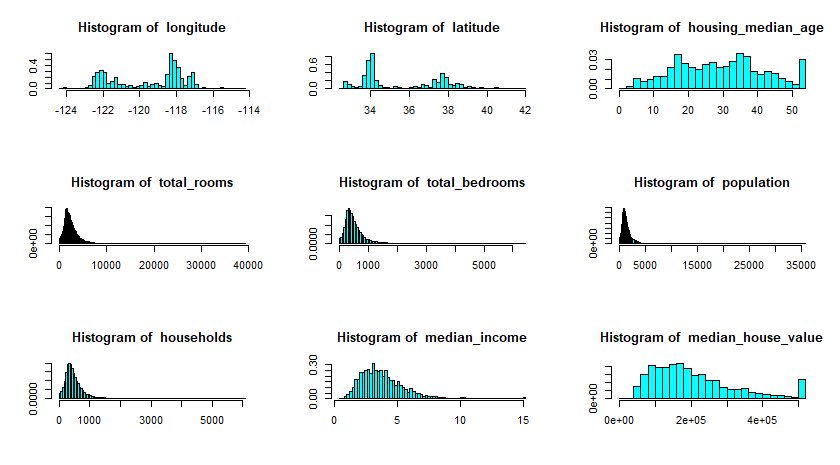
Snapshot of the dataset using head() function
You can also plot the data to have a good feel of what each attributes look like. For example, we can see than slightly over 800 districts have a median_house_value equal to about $500,000.
More importantly, I hope you have recognizes some of the more important findings such as these:
- Median income variable does not seem in US dollars. This is the good time to go back to the documentation of the dataset, and learn that this variable has been scaled and capped at 15.0001 for higher median incomes and 0.4999 for lower median incomes.
- Housing median age and median house value are also capped. The later is more serious since it will be our dependent variable. Whatever Machine learning algorithms we come up with may learn that prices never go beyond that limit. This is a good time to contact your clients and see if this is a problem or not. If it is, there are two ways to go about it:
- Collect proper labels for these data
- Remove these districts from the training set and test set.
- The variables seem to have different scale. We will discuss how to deal with this phenomenon later.
Visualizing data is an art. Drawing histogram as we have done earlier is one way to do it. Depending on your dataset, there can be many different ways to present our data in an insightful way. More often than not, a good representation of our dataset can uncover new insights and opens new channels for discovery and experimentation. In R, a very useful tools for data visualization is ggplot. There are plenty of ggplot tutorial online so I'm not going to deep in the actual syntax.
Back to our housing dataset, since we have geographical information such as latitude and longitude, it is usually a good idea to draw a scatter plot to visualize our data.
 g <- ggplot(cal_housing, aes(x = longitude, y = latitude, colour = median_income))
 g+geom_point()+scale_color_distiller(palette = "Spectral")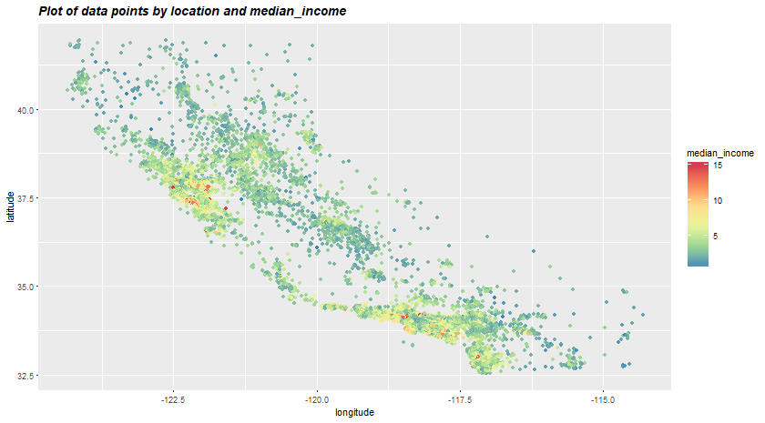
In the above plot, we have the radius of each circle represents the geographical unit's population and the color represents the house price. I hope you can see the California-like shape out of all the dots. The plot tells us that there must be a strong coorelation between housing prices and location or population density. Quite interestingly, the ocean_proximity variable may be useful but Northearn California coastal houses seem more affordable than SoCal. This means that the rules are not straightforward and it is up to the Machine Learning to detect these hidden pattern.
Another technique we could use is to compute the standard correlation coefficient between our target variable (median_house_price) and other variabels. In a nutshell, standard correlation coefficient measures the strength and relationship between 2 variables. By pitching all other variables against median_house_price, we can see which variables are strongly correlated to our target variables, thus, be useful for our prediction.
cor(subset(cal_housing, select = -c(ocean_proximity)), use = "pairwise.complete.obs")[,"median_house_value"]| Variable | Correlation with house value |
|---|---|
| longitude | -0.04596662 |
| latitude | -0.14416028 |
| housing_median_age | 0.10562341 |
| total_rooms | 0.13415311 |
| total_bedrooms | 0.04968618 |
| population | -0.02464968 |
| households | 0.06584265 |
| median_income | 0.68807521 |
| median_house_value | 1.00000000 |
Correlation of median_house_value against all other variables
The correlation ranges from -1 to 1. When it is close to 1, it means that there is a strong positive correlation. When it is close to -1, there is a strong negative correlation. 0 means no linear correlation.
We can see that there is a strong correlation between median house value and median income. Is it a coincidence that the houses of higher value usually belongs to those of higher income? Maybe.
Now that we have gained some insights about the dataset (the distribution of income, correlations between variables, etc.), maybe it's the time for us to start thinking about applying models to our dataset? Not yet. Remember that our dataset is still relatively messy, with missing values (total_bedrooms), categorical variables, etc.. This brings us to the next step, Data Cleaning (Data Wrangling) which usually takes up 70-80% of the time people spend on each data science project. The second part of the series will show you how to approach this step methodologically and effective. Click here for part 2 of the series.
The entire Python script for this project can be found at my Github page.