Catching that flight: Visualizing social network with Networkx and Basemap
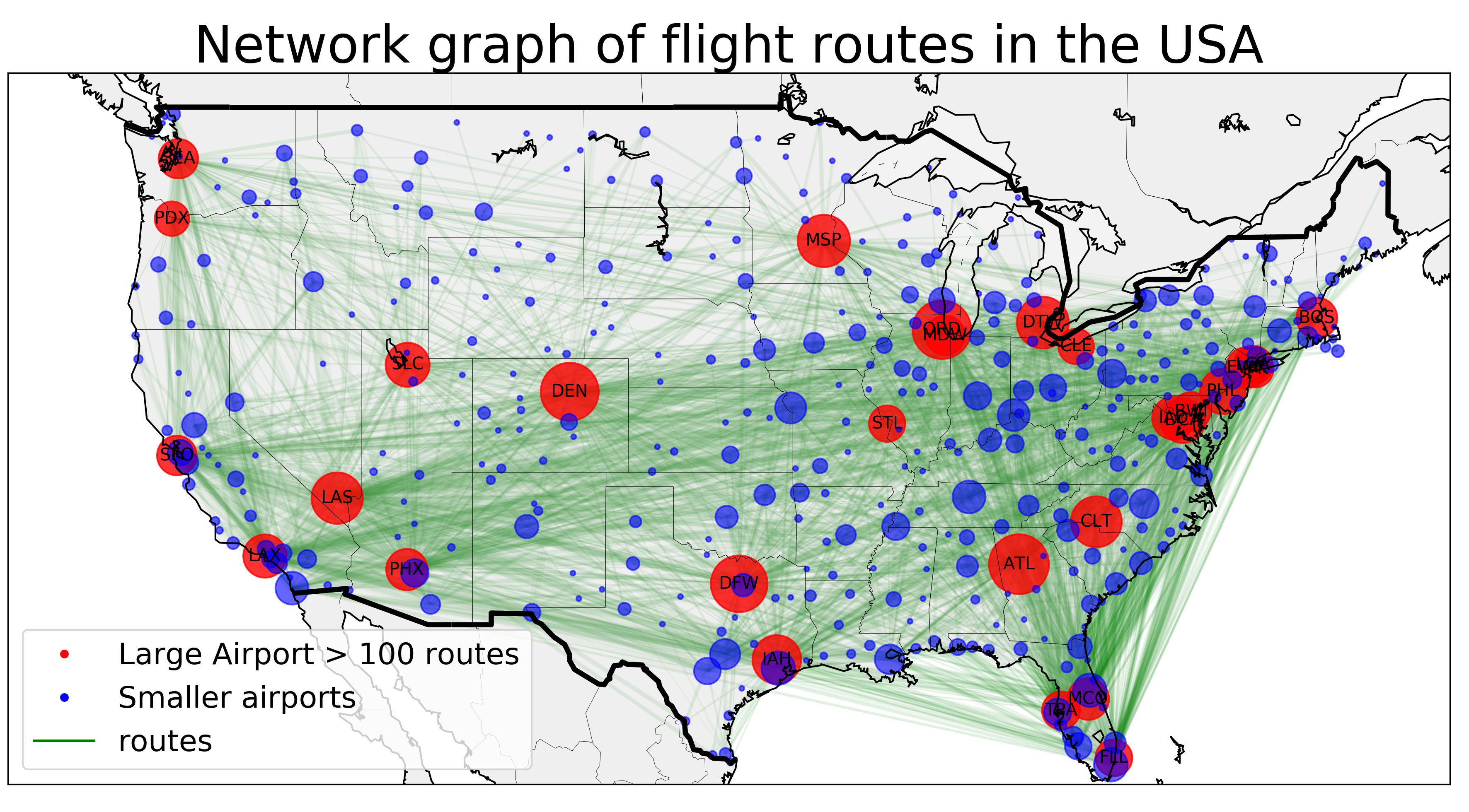
By the end of this tutorial, you shall be able to construct visualization of flight network such as this
Today, I will introduce very powerful tools to visualize network - Networkx and Basemap. Many interesting problems naturally arrive from or inspire some form of graph models - relationship between vertices (or nodes) and edges that connects these vertices. For example: the outlink and inlink structure of a website can be represented by a directed graph, in which the vertices represent web pages and directed edges represent links from one page to another. Another example is a friend circle, in which vertices represent different people and edges represent the type of relationship.
When it comes to complicated networks such as virus outbreak, or cash flows among countries, or seismic waves of the 2005 Earthquake, it remains a challenge to illustrate attributes of the network effectively. We want to quickly and visually communicate various important information at once. More important, we want the audience to quickly grasp the network in its geographical context. Networkx and Basemap (a toolkit of the matplotlib package) provides a “whole-in-one” solution, from creating network graphs over calculating various measures to neat visualizations.
In this example, we look at flight route network between airports in the United States of America. This particular example naturally asks for a method to represent vertices (airports) and edges (flight route) which somehow preserves the geographical relationships between different vertices (e.g: we want to look at the graph and tell that this vertex is JFK or Logan Airport or whatever)
At first we load the relevant packages:
 import pandas as pd
 import networkx as nx
 import matplotlib.pyplot as plt
 from mpl_toolkits.basemap import Basemap as Basemap
The matplotlib basemap toolkit is a library for plotting 2D data on maps in Python. Networkx is a comprehensive library to study network structure. Click here to see how Networkx can be used to study the structure of the flight network.
Read airport data:
The first step is to acquire the data and process it. Here, I use the OpenFlight1 database to acquire information about airports and routes. They have very comprehesive data. Unfortunately, the route database is not very up-to-date. It currently contains 59036 routes between 3209 airports on 531 airlines spanning the globe. Until today, there are up to 17 678 commercial airportsn in the world. Neverthelese, the current datasets are good enough for our illustration purpose today.
There are two relevant datasets:
- The airport.dat dataset contains geographic information of all the listed airport
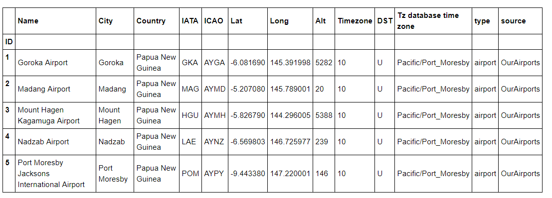
Table 1: a quick peek at what the airport.dat dataset looks like
- the routes.dat dataset contains information of all the flight routes (including airlines, source airport, destination airport, ICAO code, etc.)
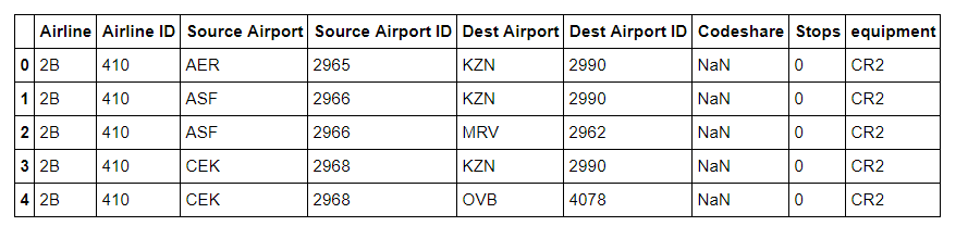
Table 2: the routes.dat dataset looks like
Process airports and routes datasets:
Networkx cannot read the data in its raw form, so our first job is to process the data to acquire a clean dataframe of routes that could be read by Networkx. Notice how the two dataset are connected by the code of the airport (the three letter IATA code). You can find the full code to process the data in my source code here.
The aim of our data-processing step is to acquire the following two Panda dataframes:
- A condensed routes_us data frame where each row represents a unique air route and the total number of airlines operate on that route (for example, there are 3 airlines that operate the flight from Lehigh Valley Airport (ABE) to Atlanta International Airport (ATL) ).
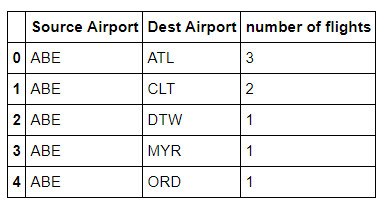
Table 3: a condensed and cleaned routes dataframe. This dataframe is used by Networkx to construct the graph network with nodes and edges
- A condensed position dataframe where each row represent each USA airports with IATA code, and more importantly, longitudinal and latitudinal details
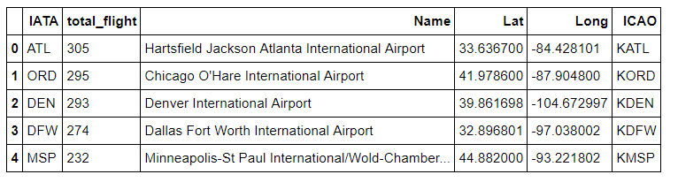
Table 4: a condensed and cleaned position of airport dataset. This dataframe is used by Basemap to plot the nodes (airports) correctly on a USA map
With the former dataframe, we are ready to draw our very first sketch of the flight networks
At first, we translated our dataframe into a graph. Notice that our graph is a Directed graph, that is, a graph with a set of vertices connected by edges having directions associated with them. This means that in our graph, the two routes JFK-ATL and ATL-JFK are separated since even though they are connecting the same 2 nodes, the two routes have different (opposite) directions.
We use Networkx's from_panda_dataframe() function to quickly import our graph. Here we create a graph from our dataframe routes_us, where the source is 'Source Airport' column, the target is 'Dest Airport' column using a Directed Graph model. edge_attr means that we can add information to the edges of the graph. I have added the number of airlines operated on a route as the edge attribute
At first we load the relevant packages:
 graph = nx.from_pandas_dataframe(routes_us, source = 'Source Airport', target = 'Dest Airport',
                        edge_attr = 'number of flights',create_using = nx.DiGraph())
Networkx does have a graphical tool that we can use to draw our network. But I guanrantee that it is not going to be very impressive.
 plt.figure(figsize = (10,9))
 nx.draw_networkx(graph)
 plt.savefig("./images/map_0.png", format = "png", dpi = 300)
 plt.show()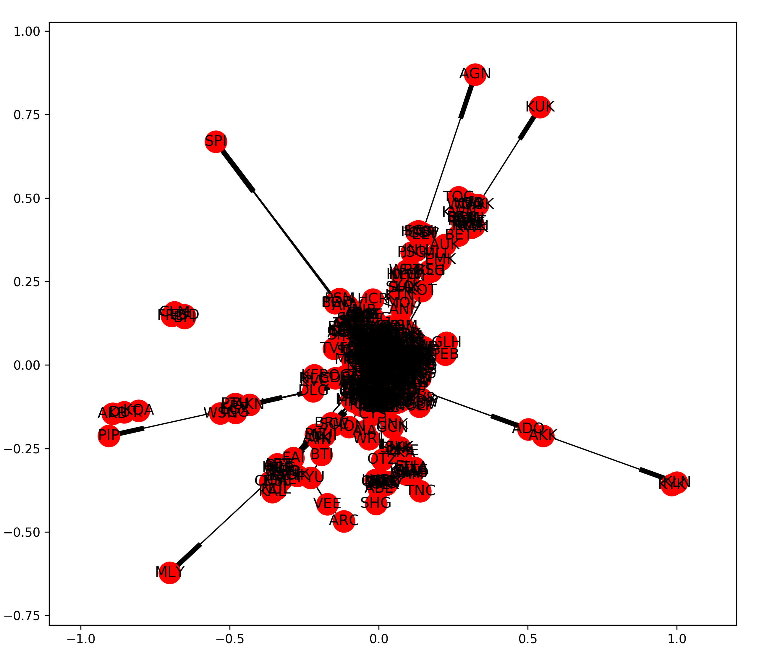
Graph drawn by Networkx's default draw network function
The problem with this rough network is that we really cannot tell which airport is which and how routes are related to one another. Maybe it is a better idea to plot the airport in the exact gepgraphical position in a American map
How do we do that?
Ah hah, Basemap !!!
Plot the network with Basemap:
Now, we need to help Basemap define the borderline of the USA. Let us define a relatively large map that includes Alaska and Puerto Rico. I also choose the familiar Mercator projection. This is a cylindrical, conformal projection with very large distortion at high latitudes. Yes, this is the wrongly misguided map in every classroom that has Alaska at the same size with the African continent
 plt.figure(figsize = (10,9))
 m = Basemap(
         projection='merc',
         llcrnrlon=-180,
         llcrnrlat=10,
         urcrnrlon=-50,
         urcrnrlat=70,
         lat_ts=0,
         resolution='l',
         suppress_ticks=True)
Now, we need to define the position of our airports on the Basemap. Until now, we only have their longitudinal and latitudinal information. We need to find their actual projection onto our Basemap. Notice how I call our position dataset, get the Long and Lat data, and project them onto Basemap surface
 mx, my = m(pos_data['Long'].values, pos_data['Lat'].values)
 pos = {}
 for count, elem in enumerate (pos_data['IATA']):
     pos[elem] = (mx[count], my[count])
The next step is to ask Networkx to add the nodes, edges and their attributes to the Basemap. This could be done as follows:
 nx.draw_networkx_nodes(G = graph, pos = pos, node_list = graph.nodes(),
                        node_color = 'r', alpha = 0.8, node_size = 100)
 nx.draw_networkx_edges(G = graph, pos = pos, edge_color='g',
                        alpha=0.2, arrows = False)
The last step is to draw the countries, coastlines, and statelines to make it actually look like a map
 m.drawcountries(linewidth = 3)
 m.drawstates(linewidth = 0.2)
 m.drawcoastlines(linewidth=3)
 plt.tight_layout()
 plt.savefig("./images/map_1.png", format = "png", dpi = 300)
 plt.show()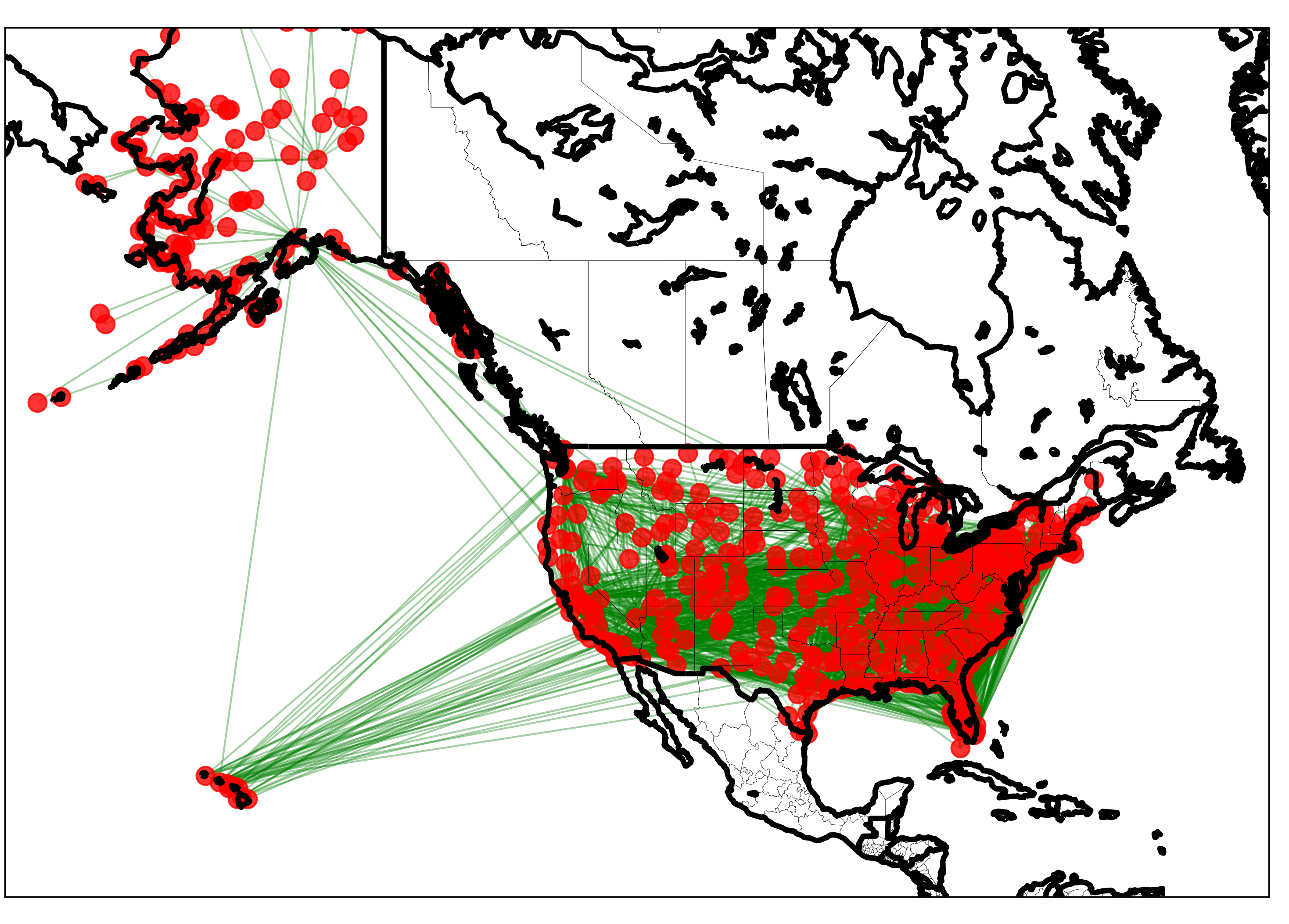
Basic graph drawn by Networkx and Basemap
Well, this plot is pretty anti-climatic. It looks fine, but not great. Besised the fact that the map looks pretty ugly, we really cannot tell anything from the graph. For example, we want to see more information such as:
- Which airports are busy?
- Which air routes are more prominent?
To answer these questions, maybe it is a good idea to incorporate the total number of incoming and outgoing flights each airport has, and plot them as the size of the airport. For example, an airport with lots of incoming and outgoing flights will have a larger size and more visible on the map.
To do that, we repeat the same code, with a small tweak:
 nx.draw_networkx_nodes(G = graph, pos = pos, node_list = graph.nodes(), node_color = 'r', alpha = 0.8,
                       node_size = [counts['total_flight'][s]*3 for s in graph.nodes()])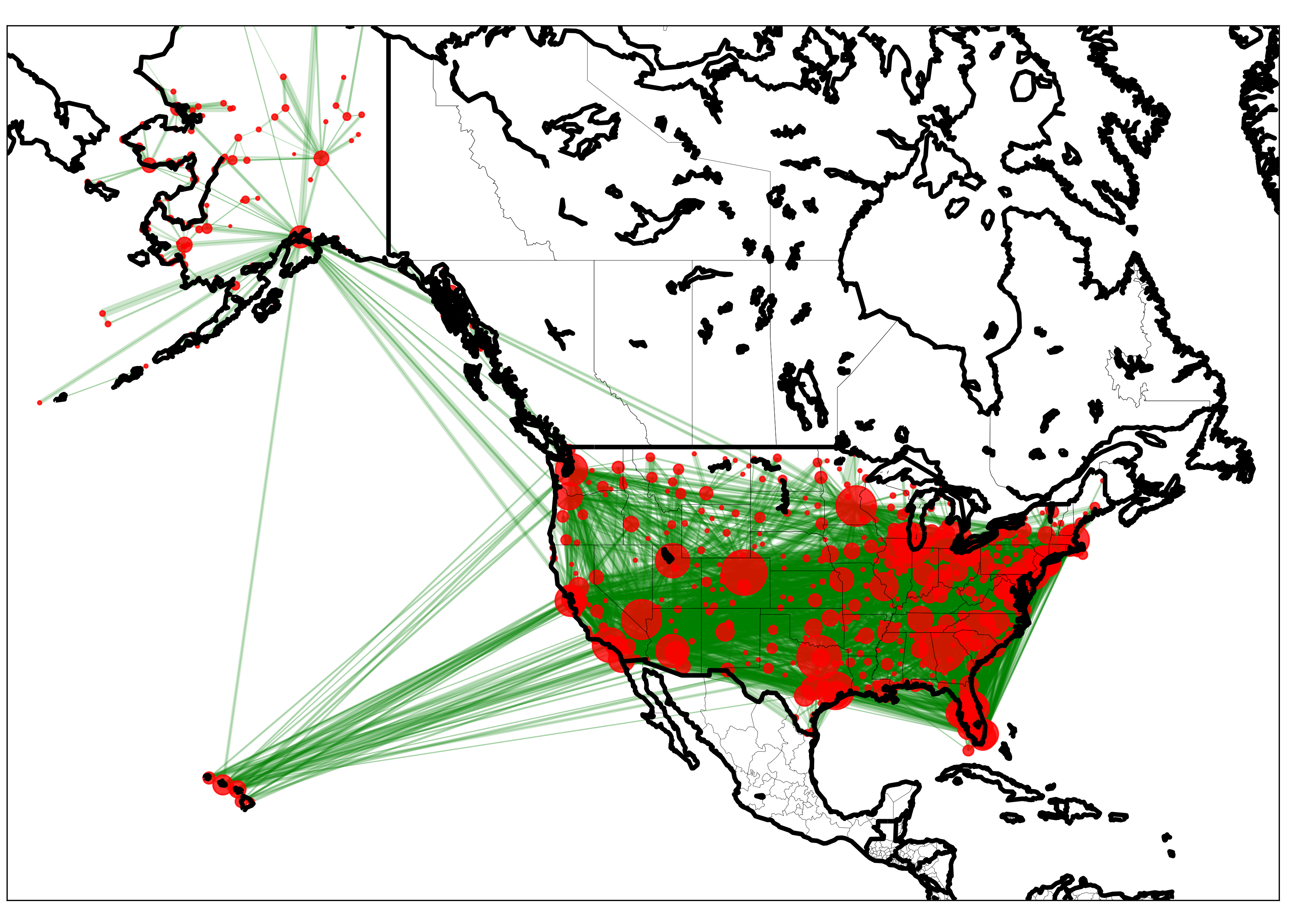
Graph drawn by Networkx and Basemap, where the node size represents the relative amount of flights in and out the airports
This is a lot better, once you have been more familiar with using Networkx and Basemap, you can start using personalize the map according to your taste.
For example, here, I restrict my map to mainland airports and style the map a little differently
Graph drawn by Networkx and Basemap, where nodes are label and split into groups of large and small airports.
Similarly, for the precision \(\tau\), we know these must be nonnegative so it makes sense to choose a distribution restricted to nonnegative values– for example, we could use an Gamma distribution with low shape and scale paraeter.
We can start to make all sorts of interesting observations: For example, a number of large airports are mostly located in the 2 coastal areas (and Vegas, Denver, Dallas/Fort Worth, Houston and Atlanta). We can start to see the domestically air routes are particularly more dense in the West Coast area, as compared to any other geographical places. Interestingly, airports such as DEN (Denver International Airport) looks as if it acts like a hub, that is, it serve as transfer (or stop-over) points to get passengers to their final destination. In future posts, I will introduce Networkx tools to analyze the distribution of edges and characteristics of nodes in such a network using Networkx
The entire Python script for this article can be found at my Github page.
Data Source: OpenFlight. Airport, airline and route data 2017 https://openflights.org/data.html